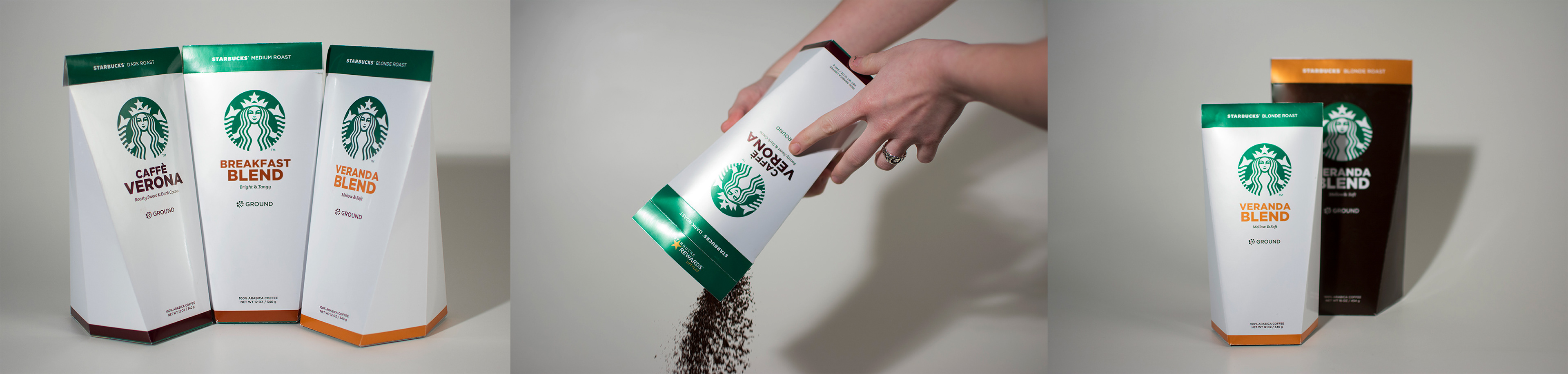

16 oz. and 12 oz. Ground Coffee Packaging
To create a system between the Starbucks Retail and Mass Market, we wanted to design the packages to be similar but have different qualities. The in-store feel in Starbucks retail is a darker and close-knit vibe, so we wanted to package to be darker to feel like it was in place. The mass retail design was white like the iconic Starbucks “Instagram-worthy” cup, bringing brand recognition to the mass retail environments.

Mass Retail
The mass retail design uses the Starbucks white color with the Starbucks green, so that it is very apparent that this product is Starbucks. Any existing problem with Starbucks retail coffee packaging is that is is not clearly differentiated from other brands on the shelf.
The Starbucks retail packaging colors could afford to be a little less “punchy” than the mass store approach. We picked a dark brown color to be reminiscent of the coffee colors found in the beans.

In Starbucks store - brown package In retail store - white package
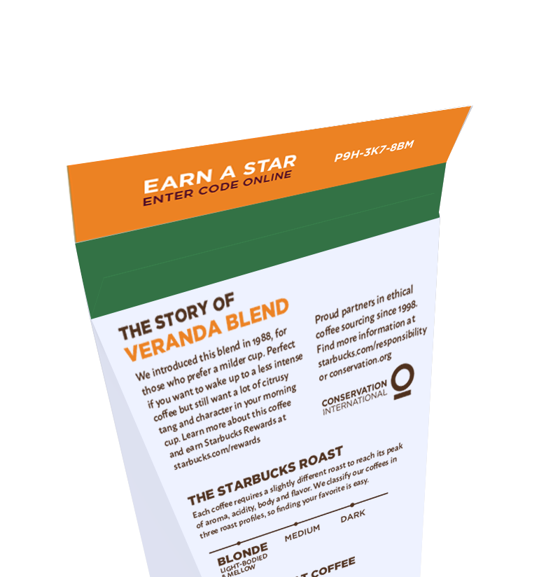
Loyalty Ready
A problem with the current rewards system in the package is that the stickers are often peeled off before the package is even purchased and taken home. We wanted to design the rewards to be hidden under the freshness flap, so that they could only be seen once the package was opened.